
During my time in the digital and design industry, I have lead some large UX and design projects. I have been part of site migration projects, checkout redesigns, iterative design sprints and content design revamps. One of my passions is testing. I have worked with some of the biggest testing tools in the industry and built hundreds of tests. This has given me the insight I needed to make informed decisions and build a better experience for the end user.
Below, are a small selection of some recent tests that I have built and launched on a well known high street retailer website. For reasons of sensitivity, I won't be able to share numbers, but I can share my hypothesis and high level outcomes.
Card Factory - Event reminders
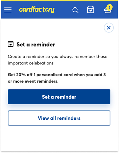
Event reminders are a big part of party sites such as Moonpig and Funky Pigeon. The aim of the test was to increase the number of customers, creating event reminders such as Birthday, for remarketing purposes, and also aid customers in their journey. It was not obvious on mobile where and how a customer could create these reminders. The icon on the site header on mobile was non existent. The customer could only create reminders at checkout or on a seperate page, taking them away from their current mission. The test introduced an icon in the header on desktop and mobile, instantiating a modal allowing users to click to see their saved events, and create a quick reminder, without taking them away from the current page. I also built links to relative product categories alongside saved events and a countdown to the event date.
The result was a massive increase in customers clicking the icon and 60% increase in users adding events in the test vs the original site experience. We even saw an appetite to shop based on their saved events as customers clicking the product category links was fairly substantial.
Card Factory - PDP product sizing
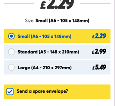
This is an example of the UI at PDP page when selecting a card size variant. The UI gives no visual indication of size relative to the others, and almost feels like it expects too much from the user. The following test was a follow up version, where I built a dropdown selector instead of radio buttons. The dropdown didn't go to plan, as customers were 'missing' the size selector at PDP, and subsequently we saw a hike in variant changes at basket.
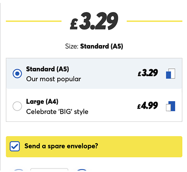
The UI of the follow up version, was changed to a more visual and emotive presentation. The card icon is consistent with basket, and represents the scale difference between each size. The wording is more reassuring and the dimensions have been removed. We saw a big difference in add to carts, less card size changes at basket and more customers entering checkout quicker.
Learning and iterating is something I am not afraid of. The dropdown variant mentioned above, was not a success, but quickly adapting and transitioning to another variant, made all the difference.
Card Factory - Password reminder
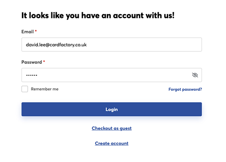
One of the main tools I use is NPS feedback. A survey that sits on the order confirmation screen, allowing the user to feedback on their experience. I couple that with GA4 funnel data, to see where in the journey customers are having issues. One of the pages that showed a high abandon rate was login. I looked at NPS and customers wre finding it hard to remember their password.
The result was to create an icon that when clicked, would temporarily show the password to the user. I worked with our data security team, to deliver an option that would be compliant and user friendly. The password would only show for a few seconds and would hide the icon if a customer tabbed to another field. We saw a reduction in abandonment at login, a daily revenue uplift of over £1000 and raised conversion rate through checkout by 0.5%. These changes were subsequently so successful, they have been implemented into the site via development.
Card Factory - Mobile navigation
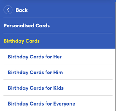
Mobile navigation is widely used, only coming second to on site search. I wanted to see if the reason why navigation wasn't utilised as much by mobile customers as search. Interestingly, site nav converted higher than search but had less people using it. I watched a few customers via MS Clarity, and noticed that a number of them were getting lost in the mix of various categories. They were unsure as to what categories awaited them when clicking on the first and second tier. They also struggled to close the menu and seemed 'locked' in the process.
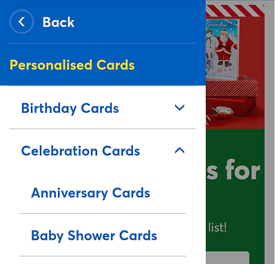
The solution was to firstly, reduce the overall width of the menu to 75%. This resulted in a opaque space that when clicked, closed the menu. The other feature of the AB test was to allow users to click through the first tier, but when the second tier was clicked the third would 'accordion' as opposed to users being shown the third tier on a seperate screen. This changed the functionality so customers can see their path and retrace their steps through the navigation easier. The result was a 7% increase in second tier clicks, the back button was used less due to the 'accordion' UI, view item and view category metrics were up and there was a 4% reduction in menu closing.
Feel free to get in touch if you want to discuss any of the above in more detail.