
A rundown of the checkout and basket user research via Maze and the Card Factory customer panel.
What we wanted to achieve
As part of our review of the basket and checkout experience, we wanted to validate our UX/UI changes with real customers. We knew we had significant issues with our multi ship service, the checkout was multi step and difficult to navigate. There was also issues with customers checking and reviewing their items, delivery and overall costs before payment. All of this information came from our analysis of data in GA4, NPS feedback and surveys in checkout. We built out prototypes in Figma based on the new UI and looked to validate this with the business's customer panel. We wanted to give users certain scenarios and journeys to ensure that our designs were a step on from the current experience. We'd also look to collect the users feedback throughout the journey as these would be unmoderated research sessions.
Using Maze
Maze was our new tool of choice in order to facilitate this research. This tool allowed us to create a survey and interactive experience using Figma prototypes and allow us to observe real life customers. We built two surveys, one dealing with the basket and the other checkout. We wanted to validate a few scenarios that we knew would have the biggest impact:
Basket
- Comparing the live basket to the prototypes
- Sending a spare envelope ease of use
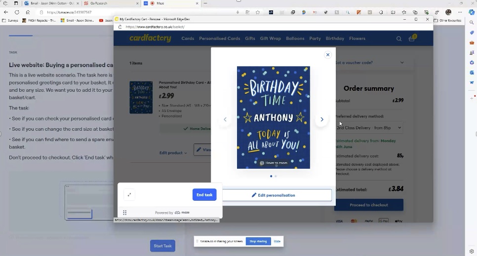
- Checking personalised items
- Amending the card size
Checkout
- Understanding Multi ship redesign
- Checking personalised items
- Reviewing orders
- Sentiment surrounding prototypes
An example survey question
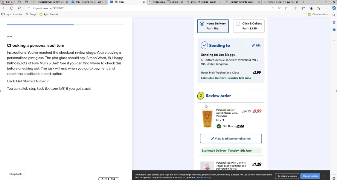
"You'll be shown a typical basket scenario, based on the new design. In this test, you will need to find the personalised notebook and check the personalisation. You need to check to see if the notebook says, 'Kayleigh's notebook'."
We showed the user a prototype of the new basket design and also gave the user a view of the current live basket and asked the same question. This gave us a good comparison one after the other. We followed up the two experiences with a question, "When checking a personalise item in the basket, did you find the new design easier compare to the live website?". The results were overwhelmingly positive in favour of the prototype with 86% prefering the new experience to the live website.
The beauty of Maze is that you can watch recordings back. We observed all recordings and recorded anecdotal feedback that may be useful:
- It all worked as expected and was all straightforward, had no problems at all.
- I think it’s very new and innovative and it would make me use the site more
- Makes things as clear as possible
- Less cluttered, too much info annoys me
Checkout analysis
Checkout analysis was a tricky one, as trying to check the prototype against a live website would be very involved, complex and long winded. So we decided to stick to validating key areas that we knew would have the biggest impact. We went with prototypes which dealt with single ship and multi ship checkout scenarios. The items would already be 'added to basket' for the user and we would try and guide them as much as possible. Not too much to skew the results and allow some freedom, but just enough so we got the correct results.
The scenarios we went with:
- Imagine you’ve reached checkout and want to send gifts to your friend Joe.
- You have reached checkout with 2 items in your basket. You want to send 1 item to your Brother Joe, and the other to your friend Charlie.
- You have already added an address and shipping option for Joe’s gift. You need to send the pink confetti balloon to your friend Charlie.
- You’ve reached the checkout review stage. You’re buying a personalised pint glass. The pint glass should say ‘Simon Ward, 18, Happy Birthday, lots of love Mum & Dad’. How would you check to see if this is correct in the checkout?
- You’ve reached checkout and want to send your entire order to your neighbour Charlie. Your default address is Joe Bloggs, 1 Hartford avenue. Charlie lives a few doors down at 5 Hartford avenue.
We also ended with a 10 second image test. We flashed the order review page infront of the user for 10 seconds and asked if they could spot the 'send a spare envelope' option. This was to validate that the customer is able to check and change this option before checking out. We knew this was an issue and was one of the most common issues reported to customer services.
The results
We had some positive comments from the users we tested the prototypes with, "Yes nice to change options", "Did what I expected", "Fairly straightforward and quick to do", "It was very easy to just add a different address for the order". We followed each step with a question asking the user how easy they found each scenario using a scale of 1-10.
We collected all the results together and summarised the feedback so we had a solid set of next steps to address the designs:
- Overall, customers found the basket prototype to be a better experience to the live basket.
- More work needed to UI when users save an address (Single ship).
- Scope to make send an envelope even more prominent.
- Multi ship seems to be more user friendly and makes sense to users.
- Most users interacted with the correct areas of the page when asked to perform tasks.
- Users were pleasantly surprised with the options available to customize and check your item at basket/checkout.
- We had an 8.4/10 average score for our checkout scenarios and good overall feedback.
- Some struggles with unmoderated testing and understanding tasks, but overall users gave very positive and useful feedback.
My reflection
Overall, this was a very successful and useful exercise. We really managed to get as much info out of the user without overwhelming them. The results were very informative and actionable with some great insight into customer behaviour and thought processes when navigating basket and checkout. If I was to run this test again, I would keep the tasks a little more concise. I was probably a little too 'greedy' when it came to getting the user to complete too many steps at once. Other than that, getting the verbal feedback, being able to observe th recordings and collecting survey responses was vital as we developed the designs further. The next stages involved amending the UI based on the feedback and A/B testing any further iterations.
This was the most rewarding and insightful user research sessions that we've done recently and one we'd definitely replicate again to ensure the user experience stays efficient.
Feel free to get in touch if you want to discuss any of the above in more detail.